How a New Design System Saved 50% in Development Time and Reduced Bounce Rate by 14% on 31 Key Pages.

SUMMARY
Company:
Hot Spring Spas
Project:
As the UX Lead, I managed the template-driven redesign and UX optimization of core brand pages to scale consistency and improve the user journey.
Responsibilities:
Experience Design and Visual Design
Timeline & Team:
6 months with cross-functional team members from content, brand,web development, content, brand, and graphic design.
OUTCOMES
Driving significant business impact through design and optimization.

50% Faster Development
By establishing a scalable design system with over 150 reusable components.

31 Core Pages Optimized
Through the creation of 10 templates, reducing time and ensuring consistency.
14% Lower Bounce Rate
Achieved on newly optimized pages by refining the user journey.
COMPANY OVERVIEW
Hot Spring Spas is a leading luxury hot tub brand, with over 1.2 million annual website visitors across roughly 250 web pages.
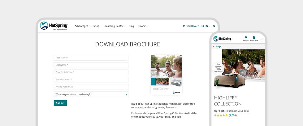
Their website provides detailed product information, educates visitors about hydrotherapy, and supports lead generation.
PROBLEM STATEMENT
The website lacked a design system, responsive layout, and a modern visual identity, creating friction for the development team and online shoppers.

The old website shown here, which lacked a modern brand look and key responsiveness areas.
PROCESS
Using a new design system as our foundation to create master page templates and optimize core shopping pages.

I used components from the new design system to build templates and redesign core pages, while identifying key areas to optimize for usability and responsiveness.
Scaling design through the creation of master page templates and turning those into high-conversion shopping experiences by working with graphic designers.


I designed a master wireframe template for our collection and model pages, partnering with graphic designers to layer in the visuals. These templates made it easy to update 23 core pages on the website.
Designing other high-impact shopping areas, like the Home and Shop pages, anchored the entire web experience.

Beyond the templates, I also tackled the redesign of core shopping areas like the Home and Shop pages, incorporating our new design system to create a cohesive experience for shoppers.
Optimizing existing pages like the Compare Collections page, helped make the layout fully responsive and easier for customers to use.

1. Introduced a comparison feature to let users easily evaluate models on a dedicated page.
2. Redesigned the layout into columns to fix text cut-off issues and remove horizontal scrolling.
3. Integrated clean iconography across specific categories to improve information scanning.
4. Optimized the global typography for better legibility by adjusting the font, sizes, and weights.
Streamlining sections across various pages with simpler layouts and progressive disclosure, making it faster for users to scan.


The jet system section on each model page needed simplification so users could quickly grasp the overview while still having interactive options to dig into the details when they wanted.


The features section on each collection and model page was refreshed with familiar UX patterns that made it much quicker and more straightforward for users to scan and browse.
Replacing several redundant button styles with a unified UI pattern reduced cognitive load for users.

I consolidated several conflicting button styles into clear primary and secondary options, making it much easier for users to instantly identify what is interactive.
See the Website in Action!
Disclaimer: The information in this case study is my own and does not necessarily reflect the views of Hot Spring Spas or Watkins Wellness.

